Creative + Art Direction by Aleksey Zozulya
Creative + Art Direction
My creative direction is inspired by the through line of “let’s experiment’. Combining different creative elements, with brand identity to generate scroll-stopping imagery. Below are some case studies of projects I’ve worked on.
Carbon Creative Studio
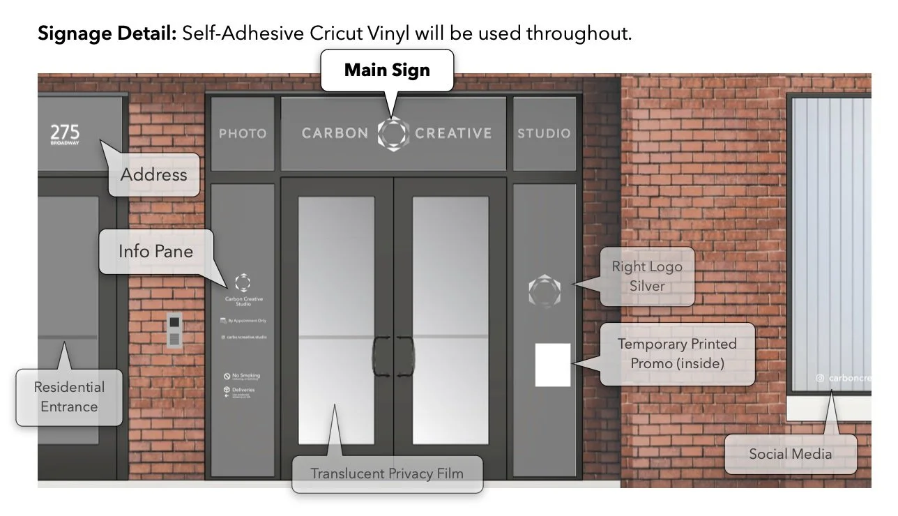
The ultimate creative experience was creating a new brand. Building off my personal brand of ‘ch3m1st’ I debuted Carbon Creative Studio as a commercial photo studio in downtown Bayonne, NJ.
I was responsible for brand identity, logo design, web design, store signage, business cards, and social media marketing.
Nanlite US
Forza Family
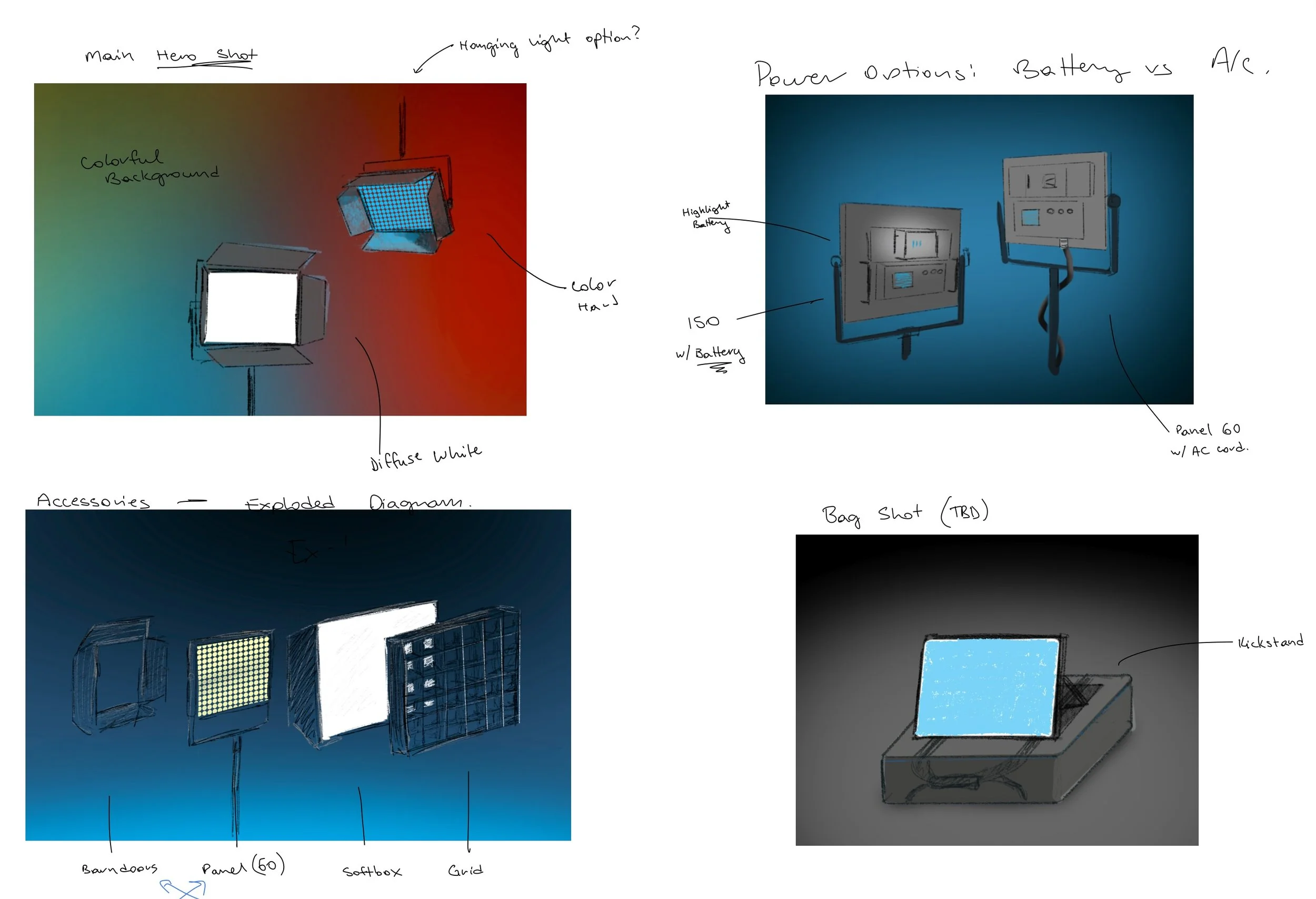
Nanlite approached me to revitalize their product detail page for their Forza Monolight LED product lineup. The initial inspiration was rock star, stage lights, and the Queen album cover.
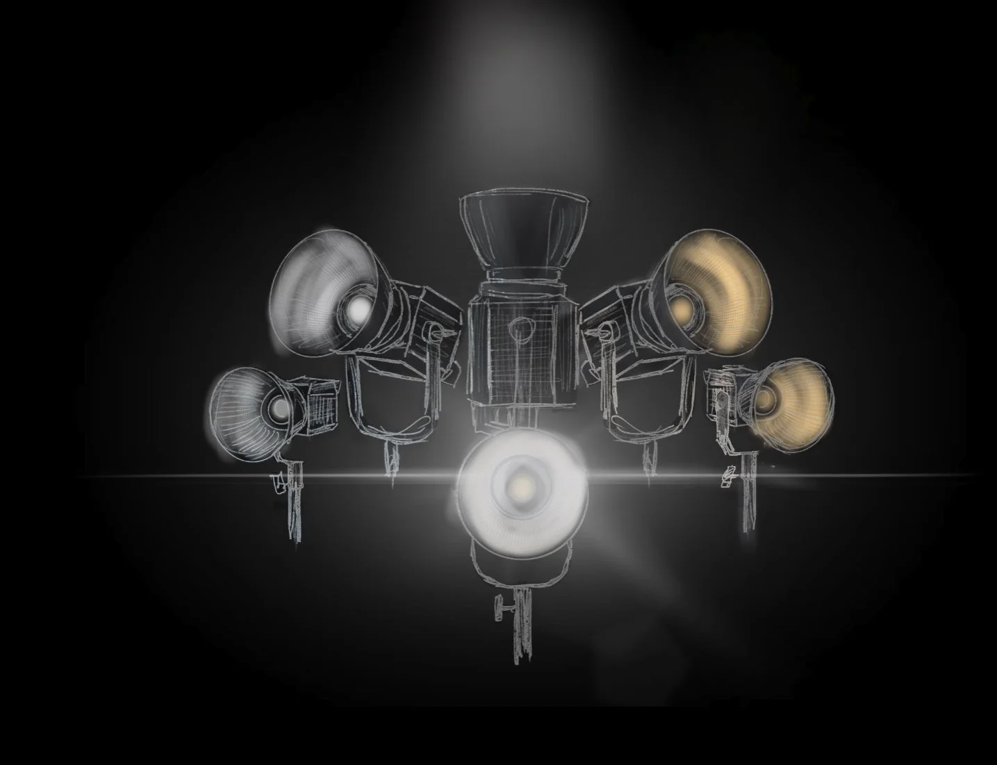
From sketch to deliverable.
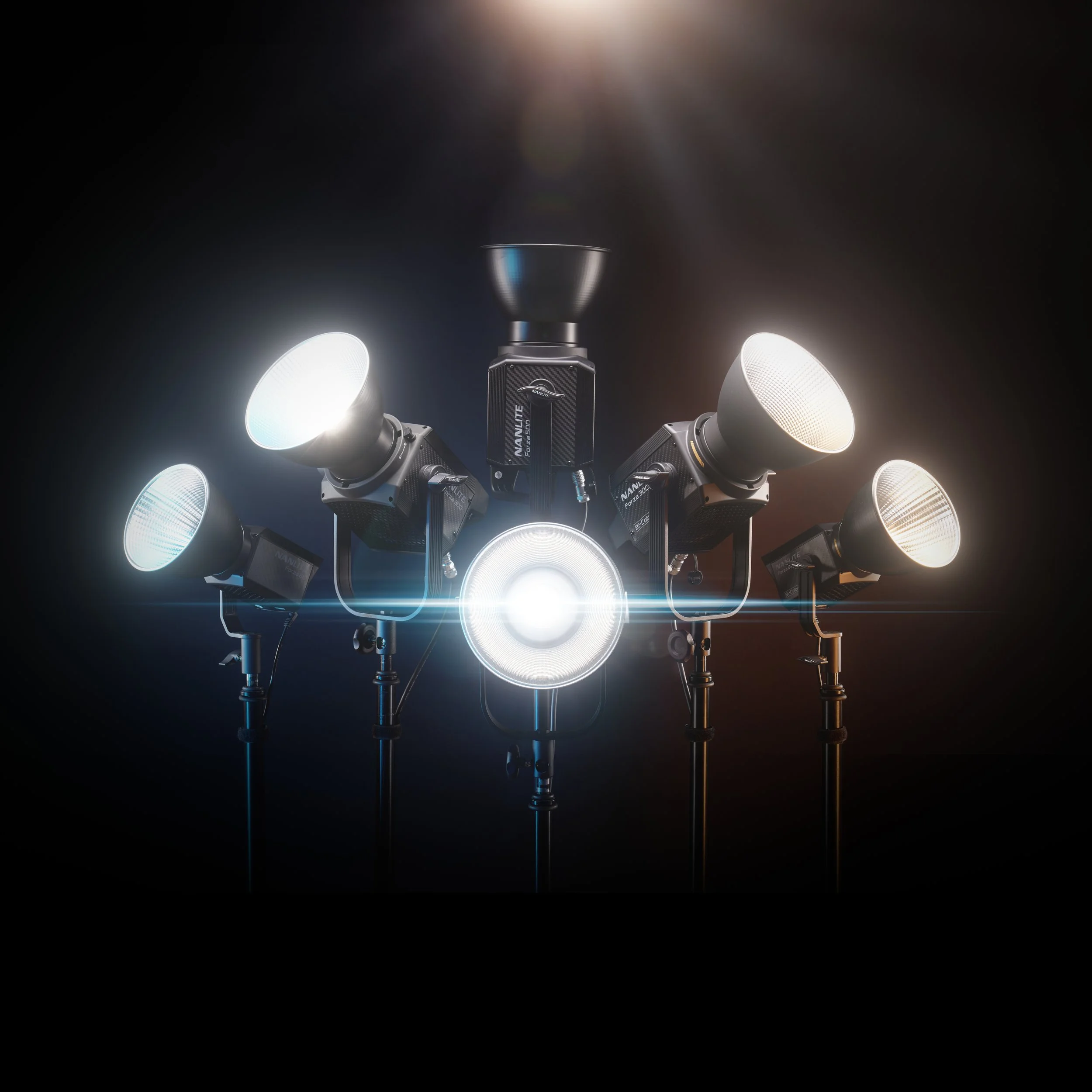
I put together a detailed sketch of the concept, using existing assets for scale reference, and then produced, photographed, and edited the final results. This image highlights the diverse product line and a nod to their bi-color feature with tones of blue and amber.
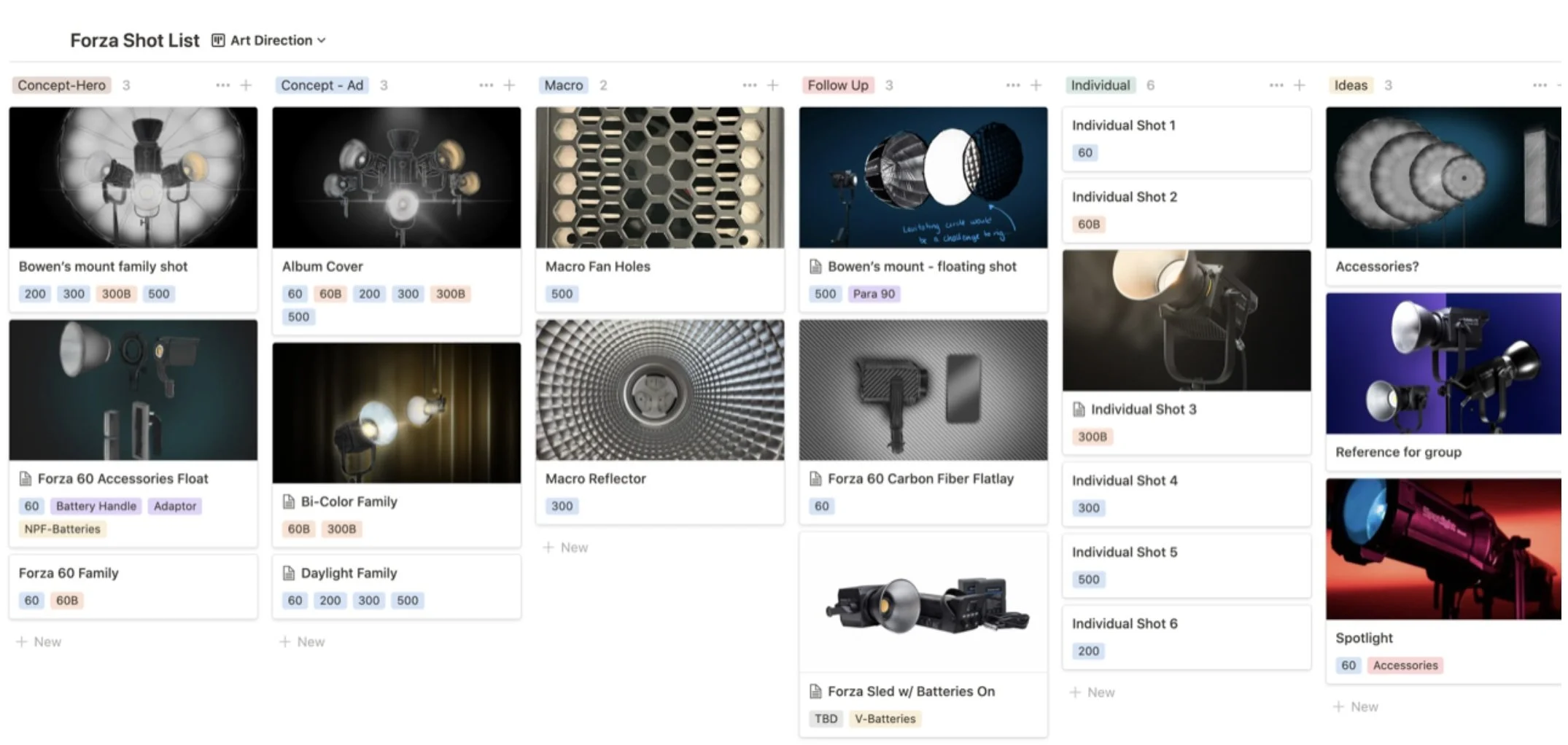
A peek behind the scene in my database, cataloging SKUs, shot types, and reference sketches
Scalable concepts
We discussed a variety of deliverables, some of which were green lit and produced, and others sunsetted. The ability to sketch out the concept for approval kept the product on time and on budget.
A proven formula.
Following the successful rebrand of the Forza lineup, I was able to re-iterate this workflow of concept to sketch to production with two additional product lines with nanlite. Sketches from the Mixpanel Photoshoot are sampled above, and final images are featured in my portfolio.
Despite being skilled in 3D rendering and graphic design, this image was (mostly) straight out of camera. I hand built a set that used countless metal hexagon tiles, and programmed the Pavotube X to output a double rainbow. The concept was inspired by this products shift to a metal hexagonal frame, and individually controlled colors/pixels.
Flowtron
Visualizing the Invisible
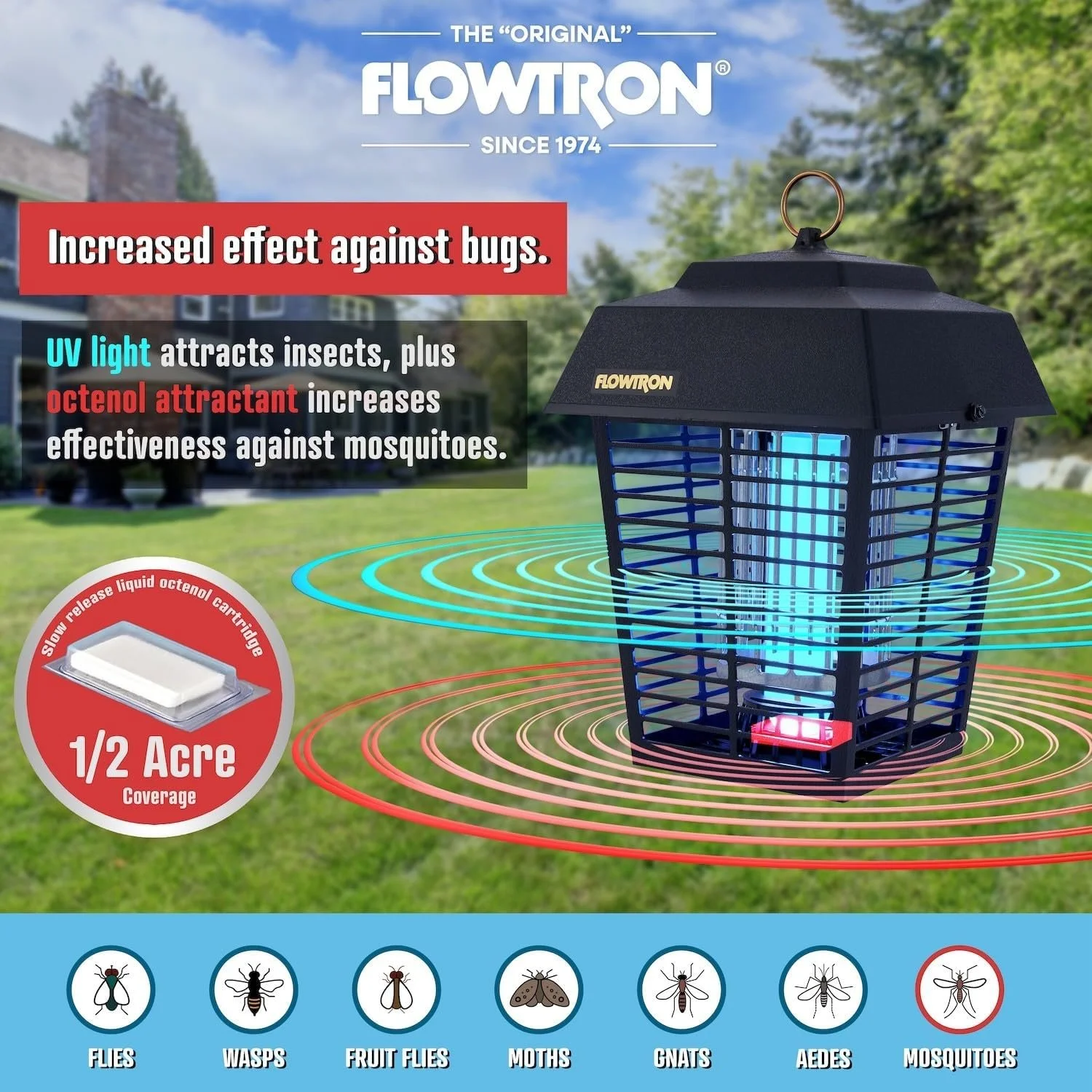
Working in house for a global brand licensee, I had the opportunity to incorporate graphic design and 3D modeling skills while implementing a new brand strategy. I was tasked with developing a way to visualize a key feature of the Flowtron bug zapper, the octenol attractant.
The left was an existing asset, and the right was my first high-fidelity proposal using a 3D asset I generated.
My approach was to incorporate existing photographic assets, with updated graphic design and a 3D element to anchor this feature. In addition, I implemented design cues from a concurrent packaging redesign to make these images future thinking.
The light blue brand color, and removal of the ‘swoop’ was inline with an upcoming packaging redesign.
The final image, as seen on the Amazon product page for the lineup. This project took a core concept, existing assets, upcoming branding direction, and outside consulting to create a cohesive brand statement - to visualize the invisible.


